the Sim Settlements forums!

Register a free account today to become a member! Once signed in, you'll be able to participate on this site by adding your own topics and posts, as well as connect with other members through your own private inbox!

Old Post Mobile Users - Please Read

GA_Darkerside

The Forum Maid
Staff member
Administrator
Moderator
Support Team
Vault Librarian
Messages
1,003
It seems that in trying to work on a better mobile site and limited but Xenforo mobile compatibility - viewing a site in landscape Mode brings up full details - where as Portrait Mode Hides them.

EG
Landscape
Capture.JPG

Portrait
Capture.JPG

Please could any Mobile users (Android, Apple) confirm this?

Many Thanks
GA_Darkerside
 
Mine shows the same in both landscape and portrait, with details hidden. I'm using a fairly old Android phone.
Work really nicely though, I have no problems navigating the site the way it's setup.
 
Mine shows the same in both landscape and portrait, with details hidden. I'm using a fairly old Android phone.
Work really nicely though, I have no problems navigating the site the way it's setup.
Same here, also Android phone.
 
It works for me. Android, 800 x 1280, 320 DPI, Opera
 

Attachments

  • Screenshot_2019-02-11-20-34-06.png
    Screenshot_2019-02-11-20-34-06.png
    123.4 KB · Views: 6
  • Screenshot_2019-02-11-20-34-22.png
    Screenshot_2019-02-11-20-34-22.png
    97.7 KB · Views: 6
Last edited:
Mine looks the same (limited details) in both landscape and portrait view. Android and Chrome browser, sadly I don't know the specs of my phone.
 
Thank you all for the information - if you feel there is anything I can do to make any area clearer, then please let me know.
 
Seems OK to me on the phone.

iPhone XS Max - Safari
Iphone_XS_Max_Safari_Landscape.png Iphone_XS_Max_Safari_Portrait.png
iPhone XS Max - Chrome
Iphone_XS_Max_Chrome_Landscape.png Iphone_XS_Max_Chrome_Portrait.png
 
You can see it happening on a desktop browser by resizing the window (or using device/responsive view in the browser's dev tools). It seems 610 width is the breakpoint causing this behavior. Devices that have a higher width resolution won't hide the details.
upload_2019-2-13_15-57-50.png
 
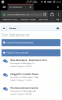
This is sort of a template issue, however more a Xenforo limitation as they don't fully support a mobile format.

However the I have toyed with older style boards in the past, coding them to , hmm how do i put this lol, have two parts, the standard and a class for mobile only, but it becomes complicated. I did think about it, but trust me, one coding error and i have turned the board yellow, made words the size of a giant, simply by missing out a " / ". (Bad GA, BAD BAD GA)

I think the answer is to buy a new phone and use it in landscape mode.

Because the Description section of the Temple only seems to cover basic HTML and CSS formatting, I even toyed with fitting in seperate text activated by 320px


Examples:
<div class="mobileShow">
TEXT OR IMAGE FOR MOBILE HERE
</div>

<style type="text/css">
.mobileShow { display: none;}

/* Smartphone Portrait and Landscape */
@media only screen
and (min-device-width : 320px)
and (max-device-width : 480px){
.mobileShow {display: inline;}
}
</style>

Funny enough the description area didn't like this at all, maybe I coded it slightly wrong, I am a dinosaur and forgotton so much.

End result - We Will Survive
 
Top